Custom Controls
OctoPrint allows you to add custom controls to the “Control” tab of its interface. Control types reach from simple buttons which trigger sending of one or more lines of GCODE to the printer over more complex controls allowing parameterization of these commands with values entered by the user to full blown GCODE script templates backed by Jinja2.
Custom controls are configured within config.yaml [1] in a controls section which
basically represents a hierarchical structure of all configured custom controls of various types.
Note
To make sure that your config.yaml stays valid when adding custom controls, don’t hesitate to take a look at the
YAML Primer.
The following example defines a control for enabling the cooling fan with a variable speed defined by the user (default 255 and selectable through a slider UI element) and a control for disabling the fan, all within a section named “Fan”, two example controls with multiple commands in a section “Example for multiple commands”, a command with printer feedback evaluation for the result of the M114 “Get Position” gcode inside a section named “Reporting” and finally a GCODE script including user input.
controls:
  - name: Fan
    layout: horizontal
    children:
    - name: Enable Fan
      command: M106 S%(speed)s
      input:
      - name: Speed (0-255)
        parameter: speed
        default: 255
        slider:
          min: 0
          max: 255
    - name: Disable Fan
      command: M107
  - name: Example for multiple commands
    children:
    - name: Move X (static)
      confirm: You are about to move the X axis right by 10mm with 3000mm/min.
      commands:
      - G91
      - G1 X10 F3000
      - G90
    - name: Move X (parametric)
      commands:
      - G91
      - G1 X%(distance)s F%(speed)s
      - G90
      input:
      - default: 10
        name: Distance
        parameter: distance
      - default: 3000
        name: Speed
        parameter: speed
  - name: Reporting
    children:
    - name: Get Position
      command: M114
      regex: "X:([-+]?[0-9.]+) Y:([-+]?[0-9.]+) Z:([-+]?[0-9.]+) E:([-+]?[0-9.]+)"
      template: "Position: X={0}, Y={1}, Z={2}, E={3}"
  - name: Fun stuff
    children:
    - name: Dance
      script: custom/dance.gco
      input:
      - name: Go arounds
        parameter: repetitions
        slider:
          max: 10
          min: 1
          step: 1
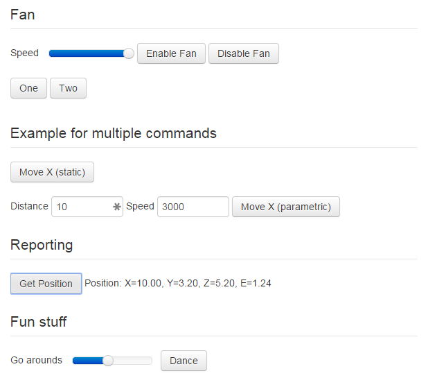
Adding this to config.yaml, restarting the OctoPrint server and switching to the “Control” tab within its
interface yields the visual representation in Fig. 1.

Fig. 1 The rendered output created through the example configuration
As you can see you have two basic types of control definitions here: controls that actually do something (providing a
button that sends one or more commands to the printer when clicked, displaying output received from the printer) and
controls that just serve as container for other controls, the latter being identified by having a children
attribute wrapping more controls.
Hint
Take a look at the Custom Control Editor plugin which allows you configuring your Custom Controls through OctoPrint’s settings interface without the need to manually edit the configuration file.
Types
Let’s take a closer look at the possible attributes that are available for both basic types.
Containers
Attribute |
Description |
|
A list of children controls or containers contained within this container |
|
(Optional) A name to display above the container, basically a section header |
|
(Optional) The layout to use for laying out the contained children, either from top to bottom ( |
Controls
Attribute |
Description |
|
The name of the control, will be displayed either on the button if it’s a control sending a command or as a label for controls which only display output. |
|
(Optional) A single GCODE command to send to the printer. Will be rendered as a button which sends the command to
the printer upon click. The button text will be the value of the |
|
(Optional) A list of GCODE commands to send to the printer. Will be rendered as a button which sends the commands
to the printer upon click. The button text will be the value of the |
|
(Optional) The name of a full blown GCODE script to send to the printer.
Will be rendered as a button which sends the script to the printer upon click. The button text will be the value
of the Values of input parameters will be available in the template context under the |
|
(Optional) A JavaScript snippet to be executed when the button rendered for |
|
(Optional) Additional classes to apply to the button of a |
|
(Optional) A JavaScript snippet returning either |
|
(Optional) A list of definitions of input parameters for a name: Enable Fan
command: M106 S%(speed)s
input:
- name: Speed (0-255)
parameter: speed
default: 255
slider:
min: 0
max: 255
In OctoPrint’s default UI input fields are always rendered left to right (inline). |
|
Name to display for the input field. |
|
Internal parameter name for the input field, used as a placeholder in |
|
Default value for the input field. |
|
(Optional) If this attribute is included, instead of an input field a slider control will
be rendered. If you don’t want to define any of |
|
(Optional) Minimum value of the slider, defaults to 0. |
|
(Optional) Maximum value of the slider, defaults to 255. |
|
(Optional) Step size per slider “tick”, defaults to 1. |
|
(Optional) A regular expression to
match against lines received from the printer to retrieve information from it (e.g. specific output). Together
with Please also read the note below. |
|
(Optional) A template to use for rendering the match of Please also read the note below. |
|
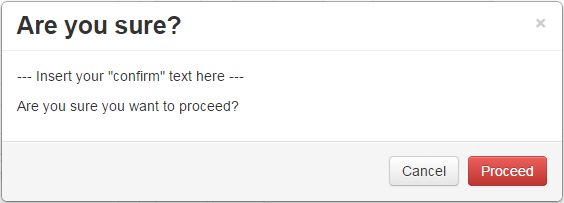
(Optional) A text to display to the user to confirm his button press. Can be used with sensitive custom controls like changing EEPROM values in order to prevent accidental clicks. The text will be displayed in a confirmation dialog like in Fig. 2. |
Note
regex and template are only supported for controls that are defined through
config.yaml. These control properties aren’t supported for controls added only in
the frontend by the getAdditionalControls
view model callback.

Fig. 2 An example confirmation dialog
Examples
Parameterized GCODE Script
name: Dance
script: custom/dance.gco
input:
- default: 5
  name: Go arounds
  parameter: repetitions
  slider:
    max: 10
    min: 1
    step: 1
{% set center_x = printer_profile.volume.width / 2 %}
{% set center_y = printer_profile.volume.depth / 2 %}
{% set speed_x = printer_profile.axes.x.speed %}
{% set speed_y = printer_profile.axes.y.speed %}
{% set speed_z = printer_profile.axes.z.speed %}
M117 run {{ script.name }}
G4 P500
G1 Z10
G1 X{{ center_x }} Y{{ center_y }} F{{ speed_x }}
M117 let's dance!
G91
G1 X-1 Y-1 F{{ speed_x }}
{% for n in range(parameters.repetitions) %}
M117 and {{ n + 1 }}
  {% if n % 2 == 0 %}
    G1 Z1 F{{ speed_z }}
    G1 Z-2 F{{ speed_z }}
    G1 Z1 F{{ speed_z }}
  {% endif %}
  G1 X2 F{{ speed_x }}
  G1 Y2 F{{ speed_y }}
  G1 X-2 F{{ speed_x }}
  G1 Y-2 F{{ speed_y }}
{% endfor %}
G90
G1 X{{ center_x }} Y{{ center_y }} F{{ speed_x }}
G28 X0 Y0
Note the usage of the parameters.repetitions template variable in the GCODE script template, which will contain
the value selected by the user for the “Go arounds” slider.
Footnotes